The Impact of Color Psychology in Signage Design: How Colors Influence Customer Behavior
When it comes to signage, design matters—but color is what truly speaks first. The moment a customer sees a sign, their brain makes split-second judgments based on the colors in front of them. That quick impression can influence everything from how trustworthy your brand feels to whether someone walks through your door.
At SignArt Graphix, we understand that choosing the right color palette isn’t just an artistic choice—it’s a strategic one. Let’s break down how color psychology impacts signage and how you can use it to attract customers, communicate your brand message, and increase conversions.
Why Color Matters in Signage Design
Color is one of the most powerful elements in marketing. It sets the tone, creates emotion, and shapes perception instantly. With effective color choices, your signs can:
- Grab attention faster
- Establish brand identity
- Influence customer mood or behavior
- Improve readability and visibility
- Enhance the customer experience
Because signs are often viewed from a distance and in motion, color becomes even more important in helping customers recognize your business quickly.
How Different Colors Influence Customer Behavior
Each color triggers emotional and psychological responses. Here’s how the most commonly used colors affect the way people perceive your sign—and your brand.
Blue — Trust, Reliability, Calm
Blue is one of the most universally preferred colors. It conveys professionalism, security, and calmness, making it ideal for financial institutions, healthcare providers, and tech companies.
Best for:
- Banks & credit unions
- Medical and dental offices
- Corporate signage
- Technology businesses
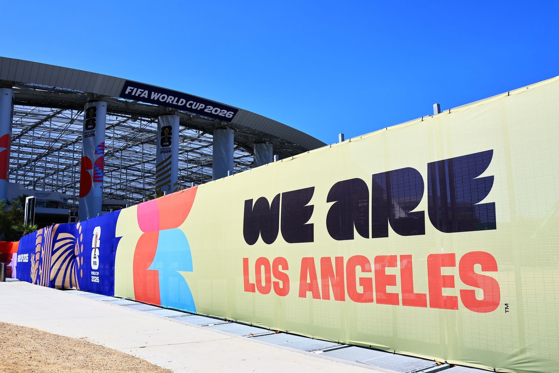
Red — Urgency, Excitement, Energy
Red grabs attention instantly. It's bold, energetic, and often associated with urgency, making it perfect for sales signage or businesses that want to spark excitement.
Best for:
- Restaurants & fast food
- Clearance or promotional signage
- Entertainment venues
Yellow — Optimism, Warmth, Attention-Grabbing
Yellow evokes happiness and positivity. It's also incredibly eye-catching—but must be used carefully, as large amounts can become overwhelming.
Best for:
- Retail stores
- Children-focused brands
- Quick-serve restaurants
- Wayfinding signs
Green — Health, Nature, Balance
Green represents growth and environmental consciousness. It’s often used by brands that promote wellness, sustainability, or finances.
Best for:
- Wellness centers
- Spas & holistic services
- Eco-friendly brands
- Landscaping companies
Purple — Luxury, Creativity, Spirituality
Purple communicates sophistication and creativity. It’s frequently used by high-end brands or businesses offering unique, boutique services.
Best for:
- Beauty & cosmetic brands
- Boutique shops
- Luxury services
- Creative studios
Orange — Enthusiasm, Friendliness, Value
Orange is fun, energetic, and approachable. It promotes enthusiasm and creativity, making it great for brands that want a youthful, friendly vibe.
Best for:
- Gyms & fitness brands
- Startups
- Value-based retail
- Automotive services
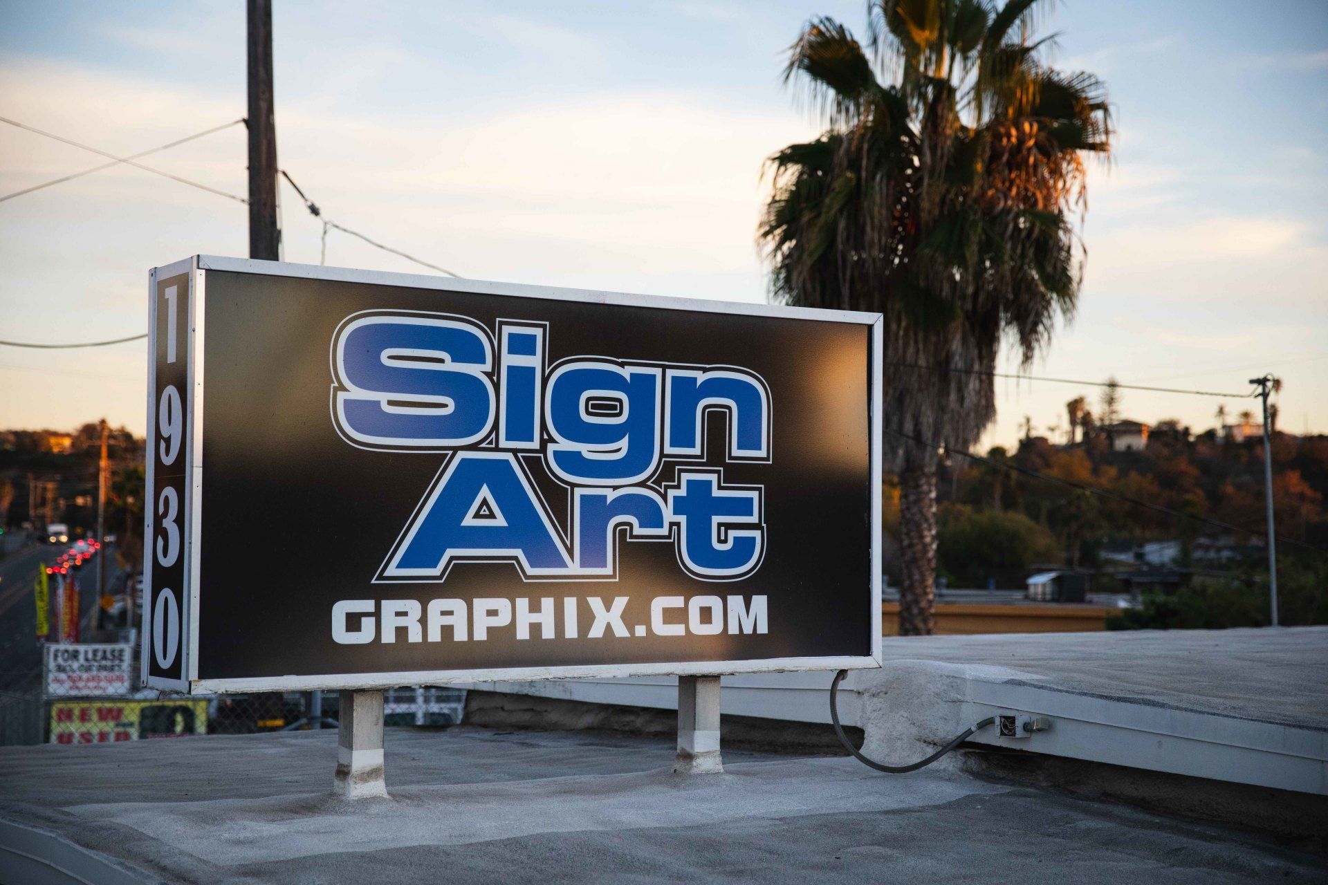
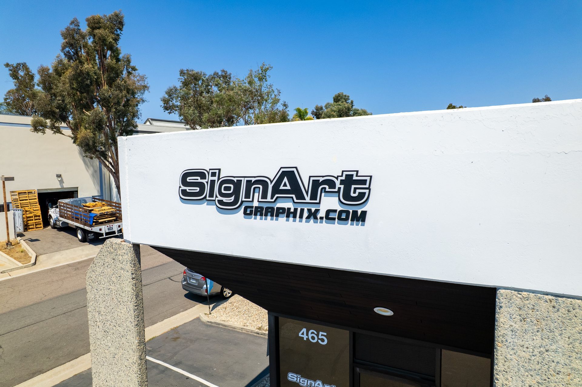
Black & White — Simplicity, Modernity, Contrast
Black and white are essential for clarity and contrast. Black adds sophistication and power, while white brings cleanliness and simplicity. Together, they create a timeless look.
Best for:
- High-end retail
- Minimalist brands
- Professional services
- Interior signage
How to Choose the Right Color Palette for Your Signage
Selecting the right colors isn’t about preference—it’s about strategy. Here’s what SignArt Graphix recommends:
1. Start With Your Brand Identity
Your signage should reflect your brand’s colors, personality, and mission. Choose tones that align with your existing visual identity.
2. Consider Your Audience
Think about the emotions you want your customers to feel. Are you aiming for excitement or trust? Luxury or affordability?
3. Prioritize Visibility and Readability
Contrast is key. High-contrast color combinations (like black on yellow or white on blue) help your signage stand out from a distance.
4. Think About the Environment
Outdoor signs compete with surroundings. The colors should stand out from nearby buildings, sky tones, and landscape.
5. Work With Professionals
Color psychology goes hand-in-hand with materials, finishes, lighting, and placement. A design expert ensures everything works together seamlessly.
How SignArt Graphix Helps You Create Impactful, Color-Driven Signage
At SignArt Graphix, we combine color psychology with expert design and fabrication to create signs that:
- Reflect your brand authentically
- Capture attention in seconds
- Encourage customer action
- Look amazing in any environment
- Provide long-term durability and visibility
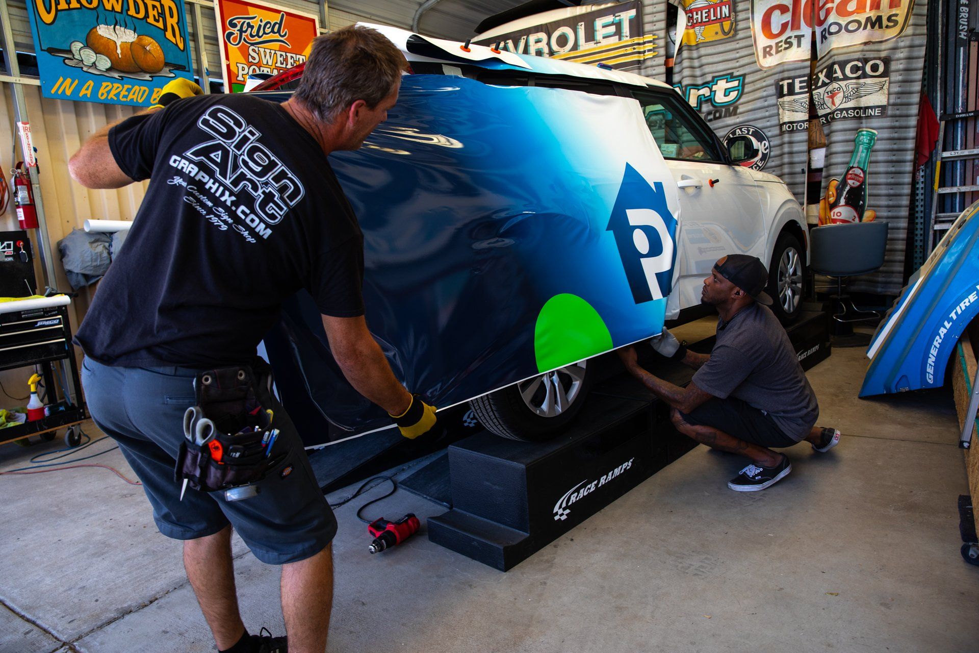
From storefront signs to vehicle wraps, interior graphics, and LED displays, our team makes sure your signage not only looks great—but works.
Final Thoughts
Color psychology is one of the most influential tools in signage design. Choosing the right colors can shape perception, strengthen brand recognition, and motivate customers to engage with your business.
With the help of SignArt Graphix, you can create signage that isn’t just visually appealing—but strategically crafted to influence customer behavior and drive results.